


Cha, cha, cha, Changes...
Happy Wednesday everyone! Hope your day has started off well!
I just wanted to drop in with little informational post about some changes that are going on around the good ol' House of Smiths blog! We have been rallying together some feedback that we have gotten about our blog over the past few years, and decided it was time to make some small changes, thanks to designerblogs.com!

Here are some things that may look a little different.
If you follow our blog in a reader, you may not be aware of these changes, and you may need to click through, to take advantage of some of the new features.
If you follow our blog in a reader, you may not be aware of these changes, and you may need to click through, to take advantage of some of the new features.
First: The fun part! Design
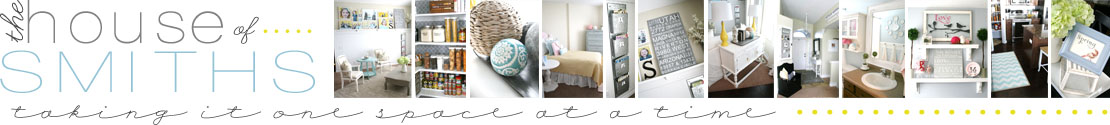
Not only have we simplified the header of our blog, with a clean new logo, and some simple photos, but we have changed our layout as well! We had requests from lots of you for larger pictures and more emphasis on the "body" of our blog........ check!

If you're looking for more information from our sponsors, other ways to connect with us (facebook, twitter, pinterest), or where to find our blog archives, then those will now be on the right hand sidebars.


That leads us into the second part! Search-a-bility :)
We realized that we had lots of fun projects, but no great way for people to find them.
We spent a few loooong weeks going back on EACH post of our blog, to re-categorize and re-label them, so that they would be easier to search for and find.
Here are the two BEST ways to find a past House of Smiths project or topic:
* Use the Search bar.

All you need to do to use this feature on our blog, is simply type in a keyword or two (like "Master Bathroom") and press search! It will rally together all the posts that have those key words, and list them towards the top of the page for you, along with additional pages.

The second way to find things on our blog is under...
* The Category Cloud.
This is basically the same idea, but you can just search right under the topic you want.
The categories are listed alphabetically, and have a number beside them to tell you how many posts have been listed under each category.

Once you click on a topic, it will take you to a page of posts that have to do with that certain category.
Those pages will be truncated, so you can brows them easier.
Another suggestion that we had from a reader, was that when they clicked on a sponsor link or a link within a post, instead of opening a NEW browser window for that link, it would transfer them to the link site within the same page and kick them off of OUR blog, which was a bit frustrating if they weren't done reading the current post on House of Smiths.
We have fixed this problem, for the most part. Any link you click on from our home page should now open a new window and direct you to that link. Some of our older post links may not do this, but from here on out they will :)
Now for some more fun stuff that designerblogs.com helped us with!
We wanted a better navigational bar, with more options. So I designed what I wanted, in photoshop elements...
sent it to Lauren @ Designer Blogs, she installed it for me and linked it up to my individual pages, no problem! I am still working on getting all of these pages up and running, so please be patient with me, if a few are empty for now. A few of the new links that I'm really excited for are the FAQ (frequently asked questions) page, and the Blogroll page!

I will finally be able to gather together a lot of the questions that I get asked over and over and share them, along with what people and sites inspire us daily!
The last thing that we did was ad a favicon image to our sites page. I have always wanted one, and so I designed my own, sent it to Lauren and she installed it for me :)

Whew! We've been workin' around here! ha! And we still have a ways to go. But I wanted to keep you all updated on the changes along the way. I hope that these features help to make visiting The House of Smiths blog easier and better! We honestly appreciate all of you so much, and are flattered EVERY day that our readers take the time to stop by and say hello or just brows around our blog :)

Ooo! And since I have your attention... today is the LAST day for voting, over at the Homes.com facebook contest page, for the "coolest space in your place"! We would be thrilled if everyone could pop over and cast one last vote for our pantry! Thank you so much to everyone who has already done so! We really appreciate the support :)

Have a Happy Wednesday!


I love it! A girlfriend and I just enlisted Designer Blogs to design our new blog for us! We cannot WAIT to see the finished product! Your blog looks great!
ReplyDeleteNice! it looks great!
ReplyDeleteThe changes are great! I love how the body of your blog is a lot wider now and the font seems bigger, too.
ReplyDeleteVery easy to read now. And it's purty. :)
Love, love, LOVE the changes! Your blog is definitely one of my favorites to look at - always so pretty and appealing. :)
ReplyDeleteLove the new layout!!!
ReplyDeleteLove, love, love the new blog design!!!
ReplyDeletePretty Cool!
ReplyDeleteCongrats on your new look! We have been working on our new look as well ~ and are making some of the same changes! It's quite the journey getting all the details done ~ we're looking forward to the same!! ~Our new site launch is in a couple weeks! (fingers crossed!) Best of luck! Cheers from the LoveFeast Gals ~ Kristin & Chris Ann
ReplyDeleteLove the new layout ~ so much easier to read :)
ReplyDeleteAaaghh! Shelley! I love it! It really is gorgeous.
ReplyDeleteIt looks great! I love the tabs on the tops and cannot wait to see what are the most frequest questions people ask you. Yes, I am a little nosy, what can I say?
ReplyDeleteIt looks beautiful! I really like the changes, and I'm glad you kept the quatrafoil. Your right. It fits your blog. :) Your new header is really cool too. Way to go you!!
ReplyDelete