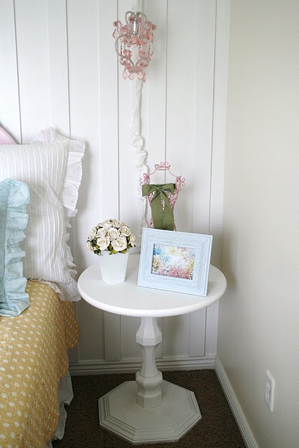
Yay! It's finally done... And here's how I did it!
I got this ugly duckling for $10 bucks at our DI, thrift store.
All heavy and ugly.... I decided to (surprise) paint him white!
I unscrewed the large, unusually heavy "stop sign" from the base...
And found a 24 inch round at Lowe's...
Here in this section
Yup... good fit!
I had started painting it right out of the package and then shortly after realized that it needed some sanding, because there were a lot of little imperfections.
After I finished painting the top, with about 3 coats of Semi-gloss white, I screwed the base back on... and I was finished!
I love how it turned out! Just what I wanted in Aubrie's room, for a nightstand.
And Cason LOVES It! :)
See... I told him it would be great!
I still have quite a ways to go with "staging" this cute table,but I wanted you to be able to see the proportions better... because a couple of people thought it looked really big! lol.
Sorry about that!
You can see how I transformed this cute little blue frame HERE
Updated table, staged:
Now... here's the REAL question...
Who needs an over sized stop sign, shape, table top????
:)
This project cost me
$10 for the table
$15 for the top (I know, a bit pricey, but WORTH it, for the already finished shape!)
Paint, free... I already had it.
Total: $25 bucks!
Sa-weet!
Linking up to


Sweet! Way to go Shelley. I can't wait to see the big reveal of the her room!
ReplyDeleteso cute! Actually you should really just make a stop sign...that would be so cute in a play room...or a boys room...someday!
ReplyDeleteLooks fabulous!
ReplyDeleteI love it, you really did a fab job!
ReplyDeleteHey I tagged you to participate in the "6th published photo" blog game. Go to my blog to check out the details!
Megan
LOVE It! Want one. Your rule you know that?
ReplyDeleteShelley that's gorgeous!
ReplyDeleteshelley i am LOVING house of smith's DIY! girl you are INSPIRING & super thrifty i might add. i LOVE it! i've got an old table that needs fixing up & this tutorial was the PERFECT inspiration to get me motivated do just that!!
ReplyDeleteSuper Super CUTE!
ReplyDeleteHey - looks good! Did you not think the hexagon shape would look good, even after it was painted? I guess not.
ReplyDeleteI sent you an email last night. Just checking that it's not in your spam folder!
Thanks, and SO pretty!
Debbie
Yes, I LOVE it! LOL, I thought that table was huge too!! Good job!
ReplyDeleteThis turned out great! I'm still new to your blog and just realized your daughter's name was the same as mine. I love how you spell Aubrie.
ReplyDeleteHmmm, I must say that I'm quite suprised at the color choice?? ;)
ReplyDeleteIt looks great!
Btw, do you get the Glidden paint @ HD? Just wondering..Think I may need to do the Autmun haze color in my entry way (that is the color, right?)..it is like the black hole..lol.. and I want to lighten it up..
OMG Perfect!!!! I love it!
ReplyDeleteI knew you would do something cute with it. The top looks so much better, more in proportion. It is darling for a girls room. So girly with the curves on the base. Your the best!
ReplyDeleteBrooke
That is so funny. I actually have a table just like that. After the revamp. I found it in a old house that was getting ready to be burned. I love it. Mine is a cream that is distressed. My dad thinks it looks like it is an upside down bird bath. He is crazy. I was loving the stand part of it. So I had to take it.
ReplyDeleteI love the table and the frame. I can't wait to make a cute table like yours.
ReplyDeleteVery nice! I love it.
ReplyDeleteWhat an adorable little table. Great re-do!
ReplyDeleteStopping by from A Little Craft Therapy, you did a great job! I love seeing what people come up with for furniture. It looks awesome, and that isn't very expensive for such a great table.
ReplyDeletefeel free to visit my blog at mythoughtsandtreasures.blogspot.com
What a transformation! I love it the way it is now. So jealous of your great find! :)
ReplyDeleteLooks like something you would spend a pretty penny on at a "new furniture" store. Love it.
ReplyDeleteScore!! It looks so good! Ya know, we just got a Lowes in town a few months ago. I know my way around Home Depot well but have only ventured to Lowes once. I'm going to have to stop there now. Thanks for answering me about the paint question. Your finishes always look great. What poly do you use? Thanks girl!!
ReplyDeleteThat turned out great! The base is awesome and the round top is so much better! Great job!
ReplyDeleteThat was such a good idea to change out the top. Amazing what a difference it made! Just beautiful!
ReplyDeleteWhat an awesome THRIFTY table and makeover...bring her over to my NIFTY THRIFTY TUESDAYS PARTY next week and show her off...hope to see you there:)
ReplyDeleteBlessings,
Linda
I’m having a GIVEAWAY…come by and check it out…I think you will like it!
It turned out fantastic! I totally thought it was a huge table too...like seats 4-6 type of huge! I must be hitting the wrong D.I.'s - the ones I go to stink (figuratively and literally.)
ReplyDeleteYou go girl! That looks so much better than before! Love the round top!
ReplyDeleteVery nice! It was cute to begin with but you have good vision, it turned out beautiful!
ReplyDeleteVery pretty re-do! Its amazing how just some white paint can transform a piece so much (oh, and a new top, and lots of elbow grease...but mainly the paint ;0) hehe)
ReplyDeleteLOVE it!! I seriously want to start looking for a piece just like that! LOVE the frame too!! You have the best decorating style!
ReplyDeleteWhat a transformation! I love how sometimes all it takes is some time and love and a little bit of paint to make something ordinary into something extraordinary! Great job!
ReplyDeleteWow, it looks awesome! You did such a great job.
ReplyDeletehttp://punkinseedproductions.blogspot.com/2010/04/cow-boy-and-cow-girl-word-blocks.html
Oops! I totally pasted the wrong thin in my last comment. How embarressing! I meant to say "Thank you for linking this to A Little Creative Therapy, with Life in the Pitts."
ReplyDeleteThis turned out so beautiful. I love the new top.
ReplyDeleteI'm hosting "Saturday is Crafty Day" on April 24th and I'd love it if you stopped by!
Very chic and very PB worthy--I want one now. Thanks for sharing!
ReplyDeleteI'll admit, I was a little nervous for you when I first saw this table ;) (My creativity is not that far along yet. I lacked the vistion). I am so impressed! I wouldn't have thought to change the top out completely! Love it!!! Now I can see!! I love the stand and the base detail!!!
ReplyDeleteI love it! I love how you decorated the table too. Thank you for linking to my link party!
ReplyDeleteThis turned out fabulous! That is a gorgeous chunky base - I love it! Great thinking with the round top! Would love to have you stop by the Sunday Showcase Party. Hope you are enjoying your weekend! You've done a great job - amazing transformation!
ReplyDeleteI featured you on my newest post "Link Love". Please go ahead to grab my "I was featured" button!
ReplyDeleteHave a nice day!
nice work! the table looks great. i was just thinking i need to find one like that.
ReplyDeleteI really have to ask.. Where did you get your daughters and your bedrooms bedding?? I honestly love it! please please tell me where I can find something like that? Thank you!
ReplyDeleteI just bought a table almost identical to this one for (insert drumroll) $1.50 at a thrift store sale =) I was so excited because I have been looking for one on my budget (even new) and could not find what I was looking for! I'm so excited to paint and update my little table!! Thank you for your inspiration!
ReplyDelete